Travel inspiration - Meg Goes Down To Boston
Hi everyone - this is Meg, Liz's design assistant. I absolutely love working for Liz / Surf Road and being able to not only practice creative expression in work constantly but also have a flexible schedule which allows for travel.
I love traveling for so so many reasons but one that resides pretty close to the top is for creative inspiration. Most of the time while I'm traveling you will see me with my phone or a camera documenting literally everything - it's honestly pretty annoying. I'll then sort through them and filter them by how they inspire me. It makes no sense and definitely confuses people looking through my travel photos but it works for me and I love it!
So recently I went to Boston to see Hamilton, and while my trip was pretty short it was filled with fun inspiration. I found a new love for Boston! Having gone to school at MassArt and spending a few years afterward working at Tufts it's fair to say I lost my love for Boston for a while. But now that I've been away for a while returning Bean City felt like it was with new eyes and I want to share with you all some of the things I thought were beautiful this time around!
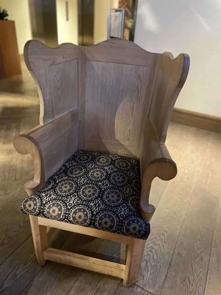
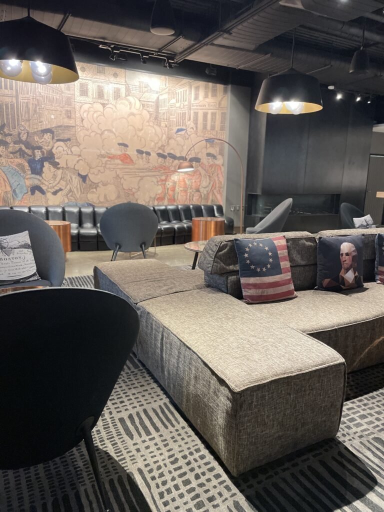
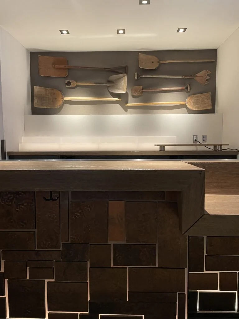
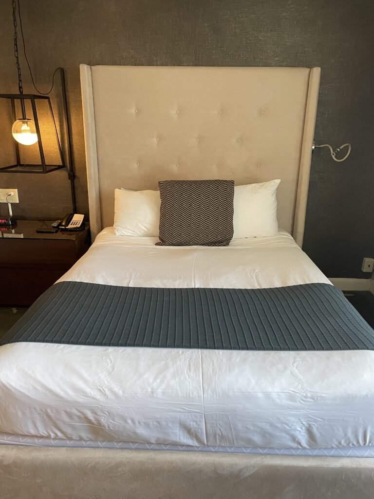
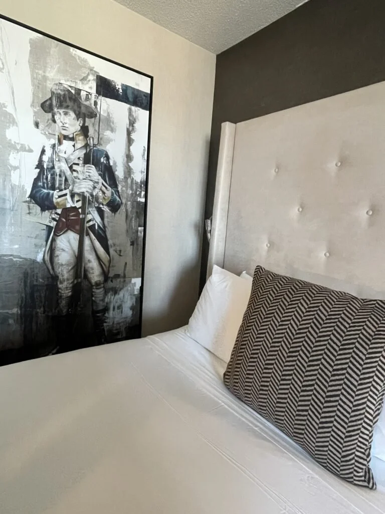
The first stop was the hotel to drop bags and freshen up and we ended up being there longer than expected - as I needed to go explore every floor and common area! The Revere Hotel does a wonderful job of melding the old with the new. Highlighting the history of Boston and exactly what the hotel is named after but keeping if very hip and actually fun! I'm in LOVE with the wooden winged chairs found in the lobby as well as the wall of antique shovels. They also did a great job of mixing up their lighting fixtures. Some more severe and sturdy fixtures between the beds was surprising but really worked with the overall aesthetic.
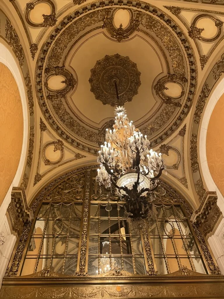
While I tend to gravitate towards more modern style I can certainly appreciate the beauty of the old. The ornate details incorporated into every inch of the Boston Opera House reminded me that I should not shy away from detail, from lavish, or even from old. If anything adding an ornate antique piece to a design would give it depth.
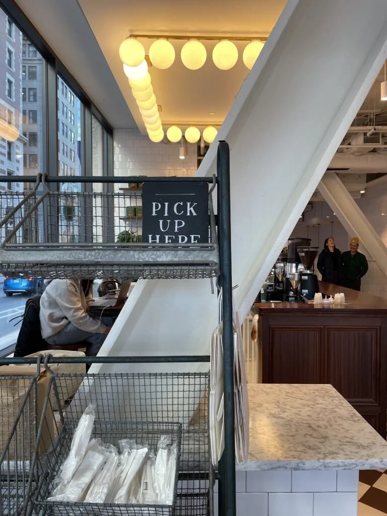
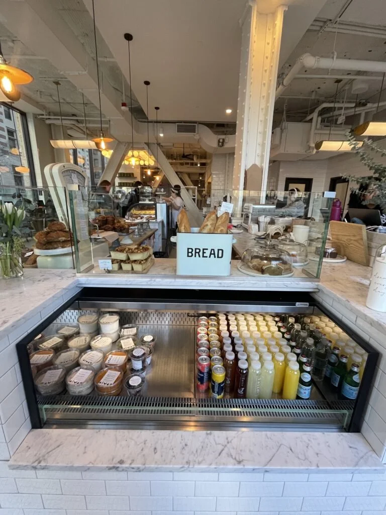
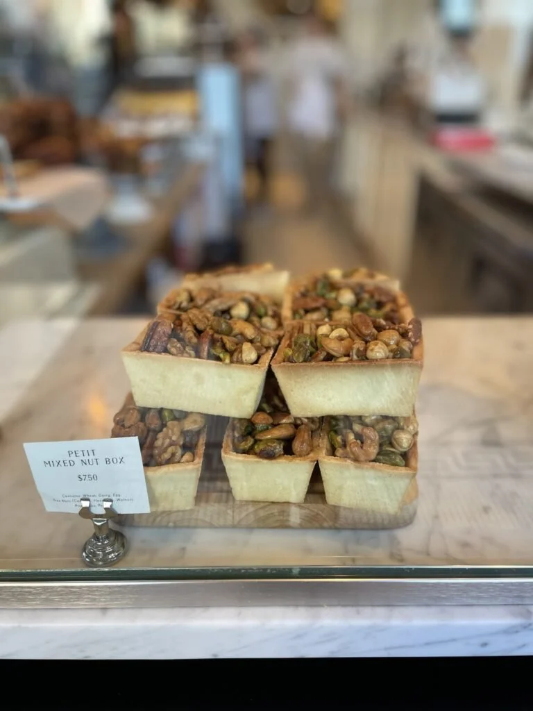
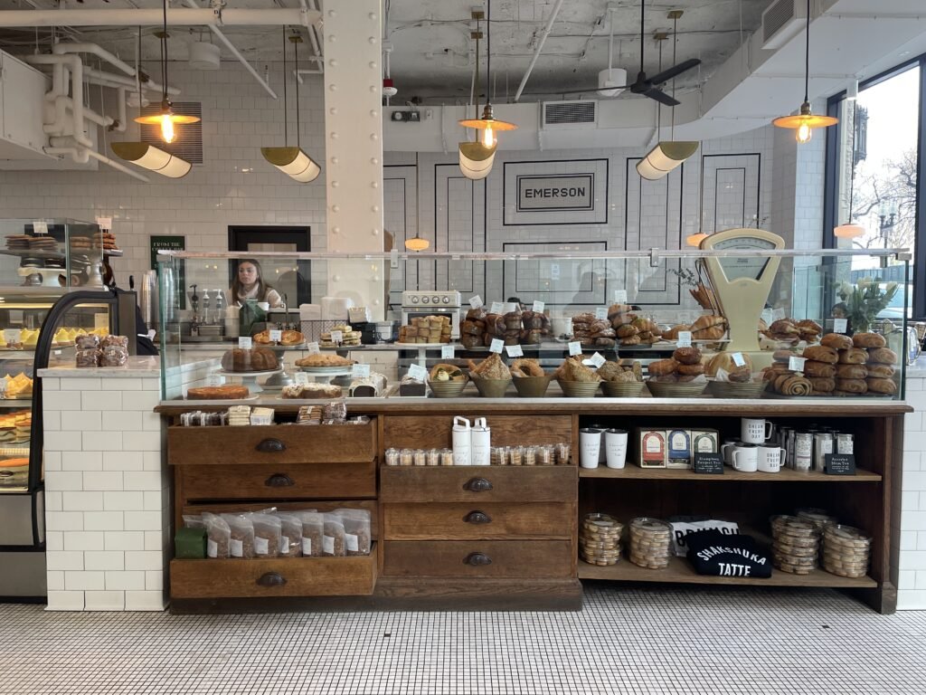
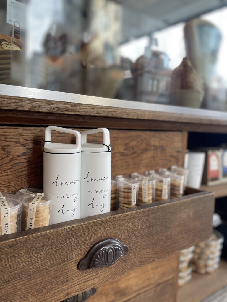
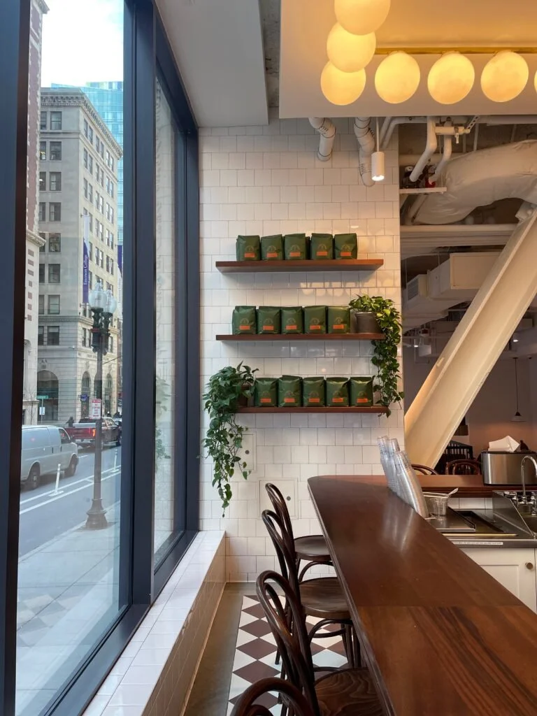
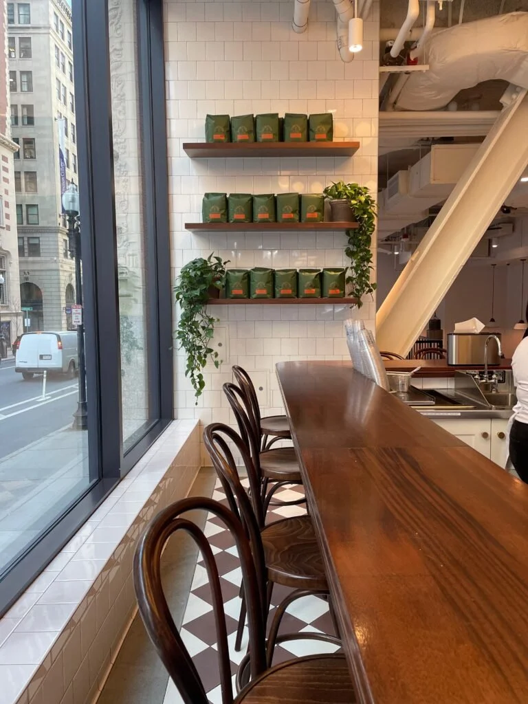
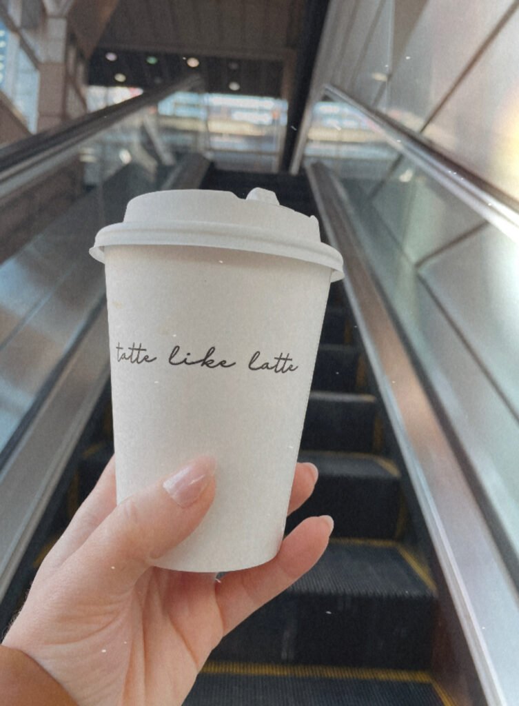
Tatte was by far my favorite part of the trip, at least visually. From the floor tile to the exposed metal beams, the countertops center placement and the layout of pastry designs. I fell in Love with Tatte and I will be going back again and again! Some highlights for me or the vintage display case and of course the staging of it. The bar stools at the coffee station, the bulb overhead lights and the use of white throughout the space which really drew the focus into the products!
There were so many others that inspired me during this trip but for the sake of your time I will narrow it down to a few!
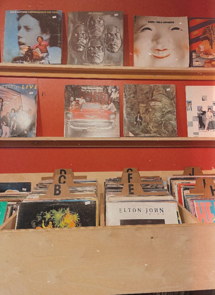
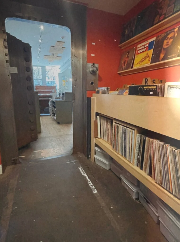
Lil's Cafe was actually a stop on the way in Kittery but I absolutely loved the aesthetic. Especially the converted vault record room. The bright red wall color really worked well to draw you in and spend time admiring the selection of records even if that wasn't your plan.
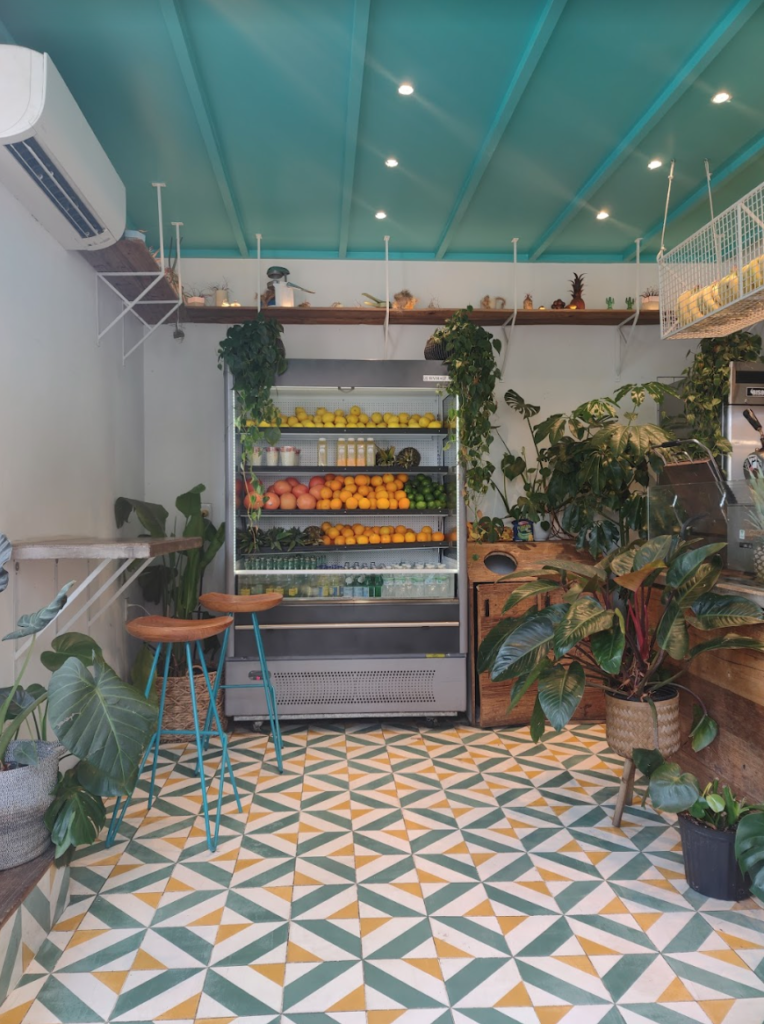
Supreme Jugos - Juice bar and health cafe is the cutest little hole in the wall I've ever seen and if I lived in Boston I would be very helpful because the design of the space is a serotonin boost!
KAVA is such a fantastic and stunning Greek restaurant. They've really nailed a modern flare on a nautical vibe.
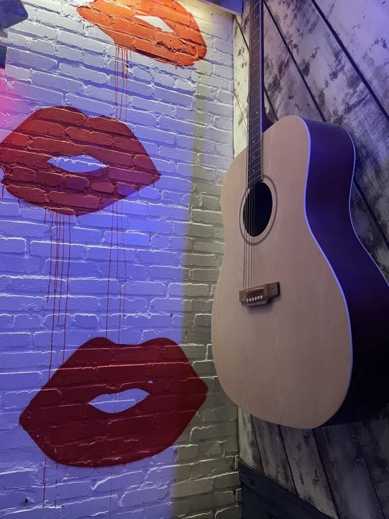
And finally NASH (the country bar that my family and i went to for a nightcap after the show) Not a place I even thought I would be raving about. But they have done Boston/Nashville in a very cool way. The mural on the staircase wall is really what did it for me not only because I'm a bug Thelma fan but also because they took something that could be soooo tacky and made it like high end incredibly photographable.
There is of course more travel inspiration but for now this Boston trip was packed full and I cannot wait for the next.

